The official sequel to 'Control,' 'Control: Resonant,' is set to release on September 24.
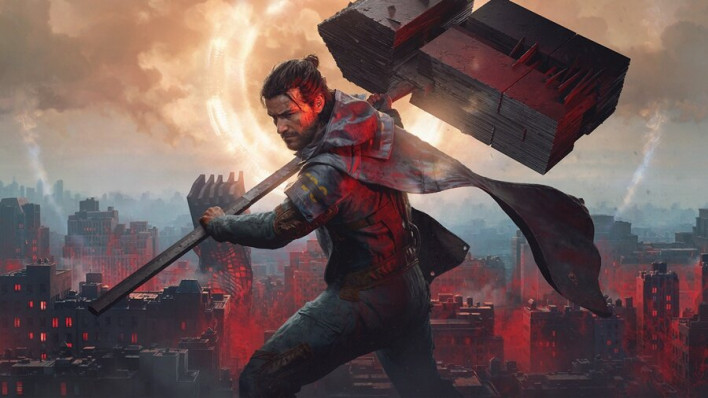
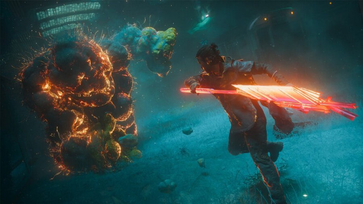
While the overarching framework remains the same—dealing with supernatural events set in the same world as its predecessor—a great deal has changed under the hood. Instead of Jesse Faden, the protagonist of the previous game, her brother Dylan, who had been confined in the Oldest House, steps up as the new protagonist. Gameplay has also shifted from gunplay-centered shooting action to melee-focused combat. The Aberrant weapon Dylan uses transforms into various shapes, such as a scythe or a hammer, creating a distinct combat identity separate from the Service Weapon of the previous game.
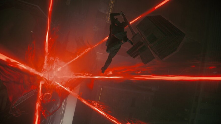
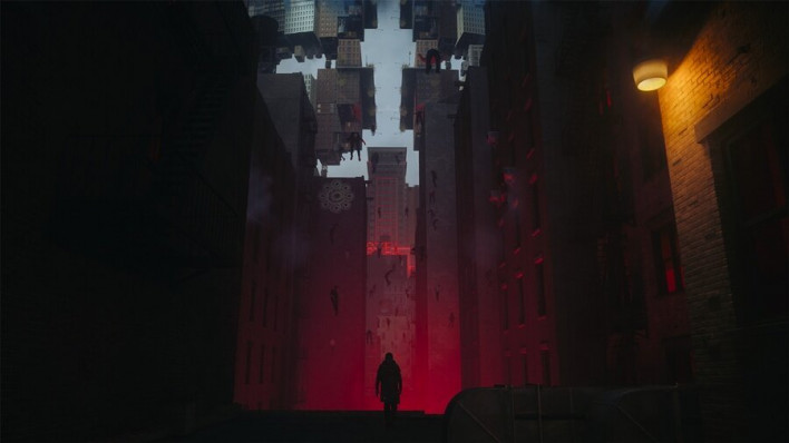
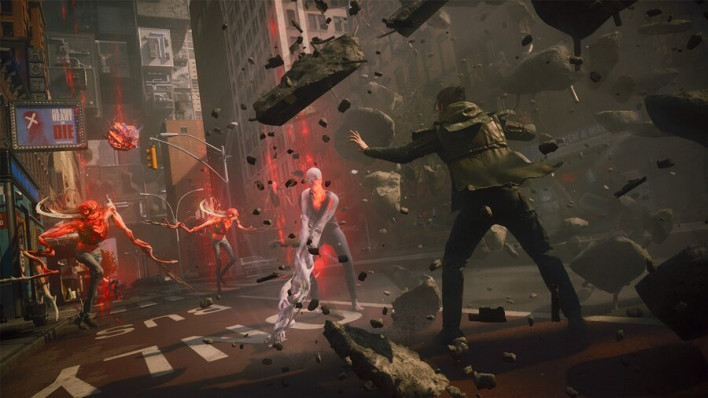
These changes are not limited to combat alone. While set in the familiar streets of Manhattan, New York, space is patterned and constantly twisted by the Resonant, at times making even the distinction between up and down meaningless. While maintaining the strange and surreal worldview established in the first game, the environment is transformed far more freely. The ways of expressing the world of 'Control' have also broadened, structuring space so that even moments when players get lost feel like new discoveries, and blending humor between horror and the bizarre.
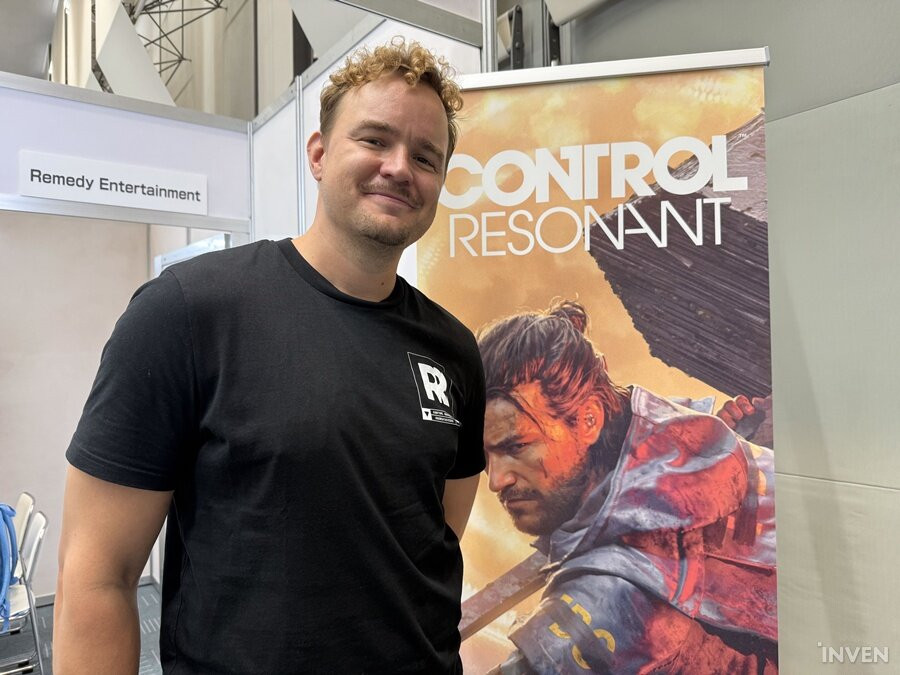
With so much changing compared to the original, what is the core identity of 'Control' that Remedy refused to let go? Where did the ideas for melee-focused combat, a constantly warping Manhattan, and the bizarre yet strangely intriguing designs of the Resonant originate? At TGS 2026, we met Remedy Entertainment Art Director Elmeri Raitanen to discuss the evolution of 'Control: Resonant' and the design philosophy behind it.
The original 'Control' was heavily defined by a "cassette futurism" aesthetic—featuring computers with 5.25-inch floppy drives, monochrome monitors, and pneumatic tubes in the executive department. If you were to define the visual style of 'Control: Resonant' with a single keyword, what would it be?
“It is difficult to define it with just one keyword. However, there was one main focus: creating a unique design. 'Control: Resonant' inevitably faces competition from many games. Because it can be compared to other titles both as an action game and in terms of creepypasta themes, we focused on making it distinct from other works in its visuals as well as its gameplay.
The world of 'Control: Resonant' is grounded in a realistic city, but filled with eerie elements reminiscent of urban legends or creepypasta. In this genre of urban fantasy, rather than simply making things scary, creating a feeling of "it's terrifying, but I can't look away; it's unsettling, but I want to know what it is" seems crucial. What kind of art design approach did you take to evoke these contrasting emotions of fear and curiosity simultaneously?
“From an emotional standpoint, the most important consideration was designing things to spark player interest. I think creepypasta works similarly. When you see a creature with a strange appearance, you get the impression, 'That looks like a person, but it wasn't.' In 'Control: Resonant,' we wanted to invoke that same 'Wait, what was that?' reaction. We designed elements so that they are scary, yet remain on your mind and make you curious about their true nature.
In that respect, the 'Control' series was somewhat easier to design, as we've never shied away from horror or body horror to begin with.
Of course, that doesn't mean we made everything strictly terrifying and grotesque. If something is too scary, players might lose interest, so we occasionally incorporated absurd elements to bring humor. A prime example is a scene where a trash can suddenly starts talking to you. It startles the player while being so ridiculous that they can't help but laugh, thinking, 'What on earth is that?' That was entirely intentional. To summarize, we designed the game to deliver a striking experience, but kept the intensity balanced so players wouldn't lose interest.
While playing for review, I was constantly amazed by the environment and map design. The spaces patterned and altered by the Resonant were particularly striking. What was the most important consideration when designing these maps?
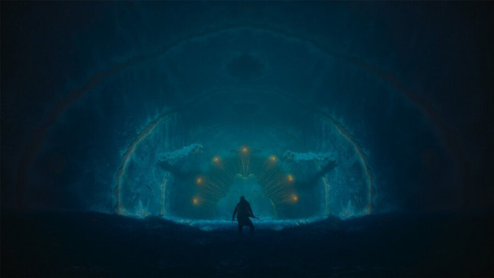
“We focused on how to transform a familiar space. Manhattan, where the game takes place, has already been featured as a setting in numerous games and movies. Therefore, we needed to break away from that familiarity—taking a recognizable place and turning it into something entirely new that players haven't experienced before. The concept of patterning grew out of that idea. As a result, Manhattan in 'Control: Resonant' was reborn as our own distinct, creative space. In a way, you could say the lore premise was born out of necessity.
Though patterning and map design started that way, it turned out to be a fantastic choice. Because of the concept of patterning, no matter how freely we warped the environment, players could naturally accept it, thinking, 'Ah, it turned out like this because of the patterning.' In practice, even when level designers created maps with vastly different sizes and structures, everything fit seamlessly into a single cohesive world. This allowed us to build engaging spaces to play in while giving level designers far more creative freedom.
In 'Control: Resonant,' orientation itself constantly shifts—top becomes bottom, bottom becomes top, walls become floors, and floors become the sky. In such environments, balancing visually striking design with intuitive readability for players must have been challenging. From an art design perspective, how did you ensure spatial readability?
“The easiest way would be painting ledges yellow or white to mark traversable areas. But we felt that approach didn't fit the gameplay experience we were aiming for, so we excluded it.
Of course, given that the spaces are close to an open world—more accurately, Remedy refers to the map structure of 'Control: Resonant' as an 'Open-Ended World'—and without explicit markers, we were aware that players might occasionally get lost.
Normally in these situations, games guide the player by giving a general sense of direction. But that also didn't align with our gameplay philosophy. We wanted players to feel the excitement of discovering something unexpected rather than the negative feeling of being lost. So rather than guiding them to easily find their way, we designed spaces so that even if they get lost, they find something interesting along the way.
That doesn't mean we leave players wandering without any clues. What we aimed for was encouraging players to observe environmental elements like street signs, naturally learning the terrain and immersing themselves in the world as they find their own path. This is the gameplay experience we wanted from the start. Having put a great deal of effort into crafting this experience, we believe players will naturally embrace it and enjoy the game.
Compared to the previous entry, combat feels much more prominent. While the original was primarily a shooter, 'Control: Resonant' shifts combat focus toward melee action. To accommodate this shift, what were your main considerations from an art design perspective?
“Since this is our first melee action game, we had huge expectations ourselves. Early in development, animators even asked back, "Are we finally making a melee action game?"
From an art design perspective, we naturally had to pay close attention to the camera. With melee combat, the camera sits closer, giving us far more visual elements to work with. For instance, shooting an enemy from afar feels relatively less intimate, but swinging a massive weapon right up close opens up many more visual possibilities.
That allowed us to try various ideas. Weapon scale was one of them. The Service Weapon in 'Control' was pistol-sized, making it hard to create striking visual presentations through scale alone. By contrast, the Aberrant in 'Control: Resonant' is quite large, making its transformations much more noticeable.
For example, when using the hammer, it suddenly swells to a massive size—sometimes causing Dylan to lose his balance—or splits into two weapons, constantly shifting forms. It almost looks as though Dylan and the Aberrant are dancing together. Such staging would have been difficult with a small weapon like the original Service Weapon.
Ultimately, as the melee weapon grew larger, we put a lot of effort into ensuring its diverse forms and stylish action could be clearly appreciated at a glance.
The Resonant designs are all distinct and unique. Given their unconventional appearances, you must have experimented with many forms. Were there specific guidelines or principles when designing the Resonant? We are also curious about the process behind selecting the final designs from so many ideas.
“When developing concepts, we always start with the story backstory and character settings. We think about who they originally were, how they gained power, and through what process they turned into a monster.
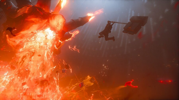
Those backstories are crafted by writers on the narrative team. It starts with asking, 'Who was this person before turning into a monster?' Another key factor to consider is their abilities. Since Dylan gains the boss's power after defeating a Reverant, the boss's appearance needed to naturally convey what kind of power they use. Whether it's telekinesis, another supernatural ability, or fire manipulation, those traits had to be woven into the character design.
After considering both character background and abilities, the art team created various concepts and developed them into the final boss designs.
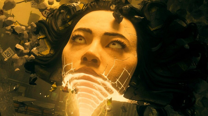
The boss featuring a giant floating woman's face in the sky—which generated buzz even before launch—was heavily inspired by medieval iconography and church architecture. As the first boss, we wanted to make it a symbolic entity, focusing on delivering a divine and majestic atmosphere. The goal was to make players feel, 'This is an entity far greater than myself.'
Personally, the first boss brought Junji Ito's works to mind. Did you draw inspiration from his work?
“I'm familiar with Junji Ito's work, and we certainly drew inspiration from it. In his works, unique patterns recur repeatedly, and there are areas in 'Control: Resonant' where similar patterns appear.
When designing enemies, do you decide "how this enemy fights" first, or "what this enemy should look like" first?
“Above all, the priority was ensuring players could instantly identify the threat type the moment they see an enemy, even during high-pacing combat.
When confronting an enemy in battle, players should be able to recognize what kind of threat it poses purely through its silhouette, stance, and movement patterns—whether it's a ranged attacker you need to close in on, or a heavily armored enemy you need to keep distance from.
So we prioritized that clarity in enemy design over detailing how they react to the Resonant. For example, if an enemy wears hard yet brittle armor, their visual design should convey that attacking them with a heavy weapon like a hammer will naturally crack or shatter their armor.
Indeed, enemies wearing that kind of brittle armor were designed so that striking them with a hammer causes their armor to crack and break apart.
The Aberrant weapon defaults to a scythe and morphs into a hammer during heavy attacks, among other forms. You must have considered many form candidates. What were some of those candidates, and what criteria led to the final set?
“To be honest, there were countless candidates. The final forms were determined through collaboration between designers and the combat design team. We wanted to support diverse playstyles. Some players enjoy closing in to land critical hits, while others prefer keeping a certain distance from enemies. We structured the weapon forms to accommodate these different playstyles. While there were many more candidates, we settled on the current forms.
When it comes to melee action and weaponry, a sword is usually the standard choice. In contrast, the Aberrant defaults to a scythe. Is there a specific reason a sword was excluded?
“We certainly considered a sword. But we didn't want to create an overly obvious default option that players would automatically pick.
We wanted each form to offer a distinct choice. Rather than choosing a sword simply because it's the archetypal melee weapon, we wanted players to make deliberate choices when picking each form.
Among the three forms available initially, the scythe fulfills a role somewhat similar to a sword. However, we didn't want to go with a form that felt too conventional or basic.
Just like in the predecessor, a strong red hue stands out in 'Control: Resonant.' In the first game, Hiss-corrupted entities emitted a red glow. What kind of visual effect did you aim to convey through this color contrast in this game?
“Red can be described as a color fully claimed by the Hiss in 'Control: Resonant.'
There are various ways to visually express the Hiss's presence. For example, there are organic bubbles or chaotically boiling screen effects seen upon death, and depending on the location, red lighting itself serves as an established motif representing the presence of the Hiss.
It is also expressed by red matter bursting out of enemies. As such, there are multiple methods for visually depicting anything tied to the Hiss.
However, that meant we could hardly use red anywhere else in the game. Because the Hiss so strongly claims the color red, using it for other elements was heavily restricted.
The new character 'Zoe De Vera' plays a crucial role for Dylan, who steps into the outside world for the first time at age 34, while also refreshing the mood with witty banter throughout gameplay. What was the most important aspect when planning and designing the character of Zoe De Vera?
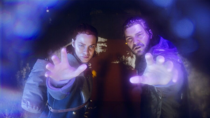
“There is a fascinating dynamic between Dylan and Zoe De Vera. Dylan spent most of his life locked inside the Oldest House. On the other hand, Zoe De Vera is a field agent operating outside the Oldest House who has no idea what happened inside. Even during the events of the first game, she was carrying out missions outside. Once Dylan gets outside and the two meet, an entertaining relationship unfolds.
For example, Zoe doesn't even know that Jesse is the Director. Conversely, Dylan doesn't even know what an iPhone is. It's a peculiar relationship where they feel like two people from completely different planets. That's why she's personally one of my favorite characters. I think Zoe herself is exceptionally well crafted, and I really love the dialogue exchanged between Zoe and Dylan.
Personally, I also really liked her musical taste. How did her taste in music help shape her character's personality? And are there any plans to release Zoe's full playlist on Spotify?
“Voice acting from a narrative standpoint, visual character design, and music are all worked on simultaneously. As a result, they influence each other, sometimes leading to unexpectedly fun outcomes. We didn't even know from the start every track that would be created. In that sense, it's really fascinating how these unforeseen elements intertwined to shape Zoe's character.
Regarding releasing the playlist, I can't speak on that right now. I'd have to check with Thomas for details. As a side note, we've always created our own music in-house, and given the great reception to the tracks released so far, we are extremely pleased as well.
While playing, there are moments where spaces or objects that initially looked like simple scenery turn out to be connected to the lore or traits of the Resonant. Could you share some visual elements intentionally placed to give players the joy of discovery while exploring?
“Since you've played it yourself, you probably know that these surprises and unique moments in the game are most enjoyable when experienced firsthand without expecting them. That's why I'd prefer not to reveal specific details. However, the game contains plenty of secrets and surprising elements. I hope players will discover and enjoy them for themselves.
No matter where I paused while playing, the scenery felt dreamlike and beautiful. I imagine many players would want to capture these scenes in photos. Why is Photo Mode not included, and are there plans to add it in the future?
“I don't recall exactly what our communications team has said on this, but we certainly want to include Photo Mode. However, much like the previous game, it will likely have to be added via a post-launch update patch.
We didn't leave it out intentionally. We are actually a very small team, and making games was much harder than anticipated. So we had to prioritize launching the game first. That's why Photo Mode couldn't be included at release. Of course, it's a feature we definitely want to add, so please wait just a little longer.
In the first game, Dylan had a harsh, bitter appearance, perhaps because he was imprisoned. In 'Control: Resonant,' while he remains hostile toward the FBC, his longer hair and beard give him a somewhat enlightened, detached demeanor. What aspect of Dylan did you want to portray through these visual changes?
“It was important for Dylan's visual appearance to align with the story progression. In 'Control,' he was stripped of his freedom and held by the Bureau, so he had short hair and looked like a victim. In 'Control: Resonant,' the situation is different. A character who was once a victim and prisoner now has to step up as a hero helping to save Manhattan. His current look was designed naturally to reflect that.
It's not just his appearance that changed; his attitude shifted as well. He gained resolve and acquired new equipment, truly stepping into his role as a protagonist. Of course, his outfit from when he was a test subject in the previous game is also included, so players can enjoy whichever look they prefer. Ultimately, the design follows the narrative arc.
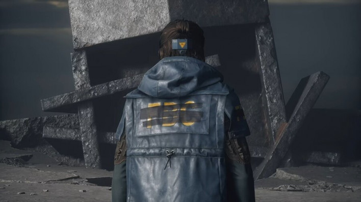
There is also an interesting detail on the coat he wears. While wearing a Bureau coat, looking closely reveals that the FBC logo is covered with masking tape. It serves as a storytelling detail showing that while he fights to save Manhattan, his hostility toward the Bureau that imprisoned him still lingers.
Jesse's design has also changed slightly. While she was neatly dressed in the previous game, this time she wears a fur-trimmed jacket that gives off a Western cowgirl vibe. What did you want to convey about Jesse through this visual change?
“In 'Control: Resonant,' Jesse has embarked on a somewhat mysterious journey. Early in the story, neither the Bureau nor the player knows exactly what is happening to Jesse. So we wanted her outfit to convey that sense of adventure—that she is currently wandering through some wilderness, continuing her journey. It's a design created with that intention.
Finally, do you have a message for the Korean fans who are eagerly awaiting 'Control: Resonant'?
“It feels really wonderful to hear positive reactions coming from Korea as well. It confirms that the things we loved and valued are reaching people on the other side of the world just the same.
Having poured so much effort into making this game, we are eagerly looking forward to the day Korean fans get to play it themselves. We hope Korean fans enjoy the experience to the fullest.
This article was originally written in Korean and translated with the help of AI. It was then edited by a native English-speaking editor. All AI-assisted translations are reviewed and refined by our newsroom.
[Read Original]