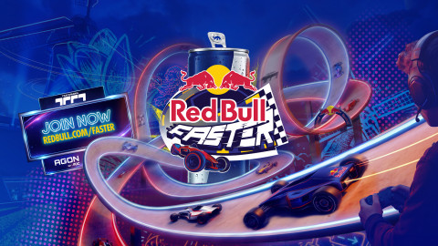
Thinking about launching or leveling up your gaming channel? Creating a great gaming logo is a sensible place to start. Your logo is the symbol of your brand. It sums up your identity as a gaming brand and what you stand for and will ultimately shape the community you’re trying to build. The following 3 tips will help you build a great gaming logo.
Create a Logo That Suits Your Audience
Your gaming logo should give the audience an inkling of what your brand is all about. It should contain themes that resonate with your viewers. Think about the kind of followers that your content might attract. Who are the viewers you’re trying to target? Are they young or older? Boys or girls? Into FPV or retro games? Are you connecting your brand to a single game or game type? A good logo reflects your viewers’ persona and incorporates the themes that connect them to your brand.
You should find a great name for your brand if you haven’t already. You could build your brand around your personal name, but most gamers will think of a pseudonym or a flashy gaming-related name that fits their brand. Along with your brand name, you should choose a typeface that ties it all together. You can also incorporate a baseline, 3-4 carefully chosen words that summarize your brand, into your logo for added impact.
Understand the Science of Color
Alongside your themes and name, the use of color in your gaming logo is an equally important part of your brand messaging. Colors elicit emotion and ambiance and convey all kinds of messages. You won’t use a fluorescent pink logo if you’re building your brand on games like Counterstrike or League of Legends.
Don’t use a color just because you like it. Use retro colors if you’re into retro games, dark colors if you’re into action games and first-person shooters, or a brighter color palette if you play games like Minecraft or Among Us. Look up color psychology in Google to find out what emotions and associations the different colors elicit in your viewers’ minds.
Be Unique
Do a little research on YouTube or Twitch and look at the logos of other gamers within your niche. If you see a bunch of logos sporting a dragon, that should be a red flag for you not to use a dragon in your logo. You want your logo to be unique and instantly recognizable to your audience. All those gamers who display similar logos with the same themes and colors missed the boat.
If you really need that dragon in your logo, then invest the time to make it your own. What can you do to that dragon to make it stand out from all other dragons in your audience’s feed? What can make that dragon say “I’m a top dog?” In your audience’s minds, if your logo doesn’t have anything original to draw them in, then you probably don’t have anything original as a content creator. Don’t be that gamer!
A bonus tip (but an important one) would be to think forward when designing and creating your gaming logo. Make sure it’s responsive so it will look its best on any device and in any application. Create your logos in various formats and dimensions, a png version and an animated version, with your brand name and without your brand name. Test your logo to make sure it looks good on your channel, social media, merchandise, etc. But, above all, put out a logo that you’re proud of! Good luck!
-
 Guest Reporter
Sort by:
Comments :0

